|
the GALLERIE
OBJECTS
CONFLICTING ENVIRONMENTS
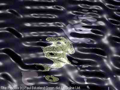
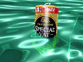
Man this is sad ! And I mean sad sad - it'll make you shed a tear for the poor bloke. To be honest I've just read the text that comes with the artists webpage and I know that I spice my comments up here at the GA, you know get a bit cutting and all to get the laughter going, but on this one I just haven't got the heart. I'll just let you read the text (BTW: the cider can pic above is shown as its the previous one in the artists article): "The idea was to continue the idea of how man made objects don't necessarily conflict with the environment to make ugly companions.As the cider tin had been so successful (well I thought so anyway) I decided to show lost coins distorted through water and reflecting golden sunlight through the shallow water on the shoreline. Sounds straight forward enough! The trouble is with ray tracing is that it shows things as they REALLY are, and not how you would like them to be! I spent ages drawing the One Pound coin, getting the relief and colour right. The positioning of the coin in the soft sand, and finally the ripples on the water to,illustrate a soft breeze. The sandy bottom to the shoreline was included ( and colour etc.); along with the cloudy sky. The water was given the co-efficients of sea water and the moonlight positioned with great care. No way could I get it right.The reflection just didn't work. It looked like a yellow confused smudge. The final attempt, after more hours of rendering than I dare admit too was what you now see here. The saving grace is that through luck the distorted coin looks strangely like the Queen's profile? Just to prove that I really spent hours on rendering the coin, you can see the image opposite during various stages of development." MAIL ME YOUR CAPTION FOR THIS IMAGE "Very funny, guys...who put the plastic vomit in the pool?" What school did this guy to? Should be blown up... |